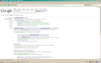
It's late, and I'm tired, so I'm just going to shamelessly borrow all of Ross's words of wisdom about the new Google UI that he came across the other day (hope you didn't copyright your email, Ross - and thanks for letting me blog about it!). Here's the UI:
[click the image to get a full-size view of it]
And here's what Ross had to say:
I was using some random machine last night, and luck of the draw got me a variance of the standard google UI that is probably being floated randomly for testing...
The left nav is actually quite interesting... the person whose computer I was using said "oh wow, you can use google to search for images too!".... interesting that google consider their top tabs to maybe be not that obvious and are testing this side nav approach... also, as the options grow, this would allow for a much more efficient long list than the horizontal tabs... "books" and "video" appear to be the new additions... maybe they want users to notice these options, specifically the new ones ;)
They've also cleaned up the results header... no longer a blue bar with the word 'Web' on the left, and the results all the way on the right.... just remove the web word, and bring the results number into a higher visibility space..
There's also some inconsistency with the "more results" text.. in the second instance it is surrounded by square brackets...not sure why... coz it's a wiki?
Sadly, as soon as I clicked images or did another search, it jumped back to the old interface... so no more playing beyond this screenshot...
the truth is out there....
Technorati tags: Google, UI, user interface, beta, test, search, search results, search engine, navigation, tabs, images, video, books, user testing, web development, information architecture, Ross Howard, WebWeaver's World, webweaver.


0 comments:
Post a Comment