UPDATE 23/02/08: I've decided to remove the Most Popular Posts from my blog for the moment - due to the ridiculous amount of time my pages were taking to load. If AffiliateBrand gets their overloaded server issues sorted out, I'll be happy to put it back up - it was a cool widget - but not when you have to wait 5 minutes to view the page...
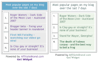
This post ended up so long that I've broken it down into three separate parts - Part 1 - setting up your widget, Part 2 - the graphics and Part 3 - the code. This is Part 1. I've had AffiliateBrand's Most Popular Posts widget on my blog for a while now, and I really like it. I have to confess, though, that I've never particularly liked the styling of it. Originally it was built as a whole bunch of nested tables, which I was able to restyle to a certain extent using my own stylesheet (in this image the original is on the left, my restyled version is on the right).
You can find out more about using your own stylesheet in my original post Blogger beta - Most Popular Posts widget. Although the first part of that post is no longer entirely relevant, the bit about making and using your own stylesheet is. You'll be following those instructions in step 3 below. A couple of weeks ago the crew at AffiliateBrand decided to update the "look" of the widget, giving it graphical curved corners and stuff. It didn't match my blog at all so I didn't switch over. Yesterday they switched me over anyway (as they have now done with everyone) and suddenly my purple and blue widget looked very out of place in my green blog...
Being a bit of a perfectionist about the look of my blog, I decided to see if I could do anything about restyling it, so that it matched everything else.  I've figured out a solution, as you can see, so I thought I'd share it with you. If you're using the same Blogger template as I am (Rounders 4), you'll be able to use my code and images exactly as I've created them. If you're using a different template, you'll need to have some Photoshop (or other graphics program) skillz in order to make your images, but you can still use my code, and you'll be able to use my images as "templates" from which to make your own.
Follow me below the fold to see how it's done...
The steps are as follows:
In part 1 you will set up the widget:
In part 2 you will do the graphics:
In part 3 you will reconfigure the code:
Step 1 - Register with AffiliateBrand and get your JavaScript
Go to Enhance Your Blog With AffiliateBrand Blog Window Widget and follow the instructions. They're pretty self-explanatory. One thing to note: they mention in their instructions adding two pieces of JavaScript, but I think that's out of date - there's only one piece now. You'll see that when you follow the process through.
Step 2 - Add the JavaScript to your blog within a Page Element in your Template
There's more info on how to do this in my original post on the subject - Blogger beta - Most Popular Posts widget - you can ignore instructions 1-5 (they're no longer necessary) and start at step 6.
Step 3 - Style the inner part of the widget (the list of your most popular posts) by creating your own stylesheet and modifying it
There are details on how to do this in my original post - Blogger beta - Most Popular Posts widget. Scroll down to the second image on the page where it says "Let's assume everything went as planned and your widget is in place and starting to populate itself. What else can you do to it?" and start from there... Follow the instructions and when you're done, it's time to move on to Part 2 - the graphics.
Technorati tags: Blogger beta, hacks, widget, most popular posts, restyle, restyling, 2.0, AffiliateBrand, Blog Window Widget, Gene Kavner, web development, WebWeaver's World, webweaver.
You are here: Home > How to restyle your Most Popular Posts widget - Part 1 - setting up your widget
Sunday, May 27, 2007
How to restyle your Most Popular Posts widget - Part 1 - setting up your widget
Posted by
webweaver
at
2:19 pm
![]()
Labels: Blogger beta hints and tips, blogging, web geekery
Subscribe to:
Post Comments (Atom)


2 comments:
Hi, WebWeaver!
I'm having a difficult time putting together the widget for my page: http://standup101.blogspot.com
I used a page element and inserted the code. And now it appears on my page. But I don't see a "2nd" line of code given to me when I registered. I know I should place it in my template, but I don't know where it is. Is it the same line of code?
Perhaps, you can direct me to where I would find it.
Feel free to email at my gmail address: StandUp101 (at) gmail (dot) com
thanks much
lucy
Hi Lucy!
Great to see you're trying out the widget!
There's only ONE line of code now. The two lines I mentioned were in the original widget, but they changed that when they restyled it. So the line you have already put in is the only one you need from AffiliateBrand. Hope that helps.
Post a Comment