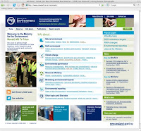
 Earlier on in the year we were given the opportunity to pitch for a re-design job on the Ministry for the Environment's website, which we won. Sue and I were completely thrilled - it's the first Government client that WebWeaver Productions has pitched for (although I've worked on over 50 government websites as a contractor and/or employee), so to win it was pretty darned cool.
Our primary contact was Dee Guja, the Ministry's senior adviser, Stakeholder Engagement/Publications, and we worked on the project with the Ministry's webmaster, Jennifer Geard. Both Dee and Jennifer are very good at their jobs, and as a result the Ministry has become one of our favourite clients - they absolutely rock!
The brief was tricky, to say the least. The Ministry's website is huge - somewhere around 13,000 pages - and the old site was based on a set of Dreamweaver templates which were pretty old and had a bunch of table-based layouts to contend with. Over the years many different MfE employees have added content to the Ministry site, and in some cases the code used to display the same 'look' has been achieved using a variety of techniques - some of which are now out of date and no longer validate.
Our job was to design and build a new set of e-government compliant best-practice Dreamweaver templates which would seamlessly replace the old ones, together with a stylesheet that would not only control the new template HTML, but would restyle all of the old legacy code within the subnav, main content area and feature column so that it would display properly in the design without the Ministry web team having to rewrite the HTML.
Oh - and it needed to be sufficiently robust and all-encompassing so that Jennifer and her team could be confident that all 13,000 pages would display as expected - without having to check every page before go-live.
Sue worked her magic and produced a beautiful new design which was light years away from the old design. I built a set of 11 HTML/CSS templates which I then converted to Dreamweaver templates, matching the editable regions as closely as possible to their existing ones so that when Jennifer came to do the global 'find and replace' that would replace their old templates with our new ones, the site would hold together.
Our test list consisted of 16 different browser/OS combinations (the number has been somewhat reduced since then), which meant I had to get on TradeMe and buy a bunch of old PCs so that I could get the full range of PC operating systems I needed for testing. The completely awesome standalone versions of IE6 and IE7 no longer work properly when you've got IE8 installed, so I needed separate versions of the same OS in order to test all three versions of IE. Oh joy.
The project began back in April, and the site went live in June, which is not bad going for such a large website. Jennifer and her team are working through the site to remove the worst (legacy) examples of non-compliant code, and the new templates were tested for e-govt compliance by Bruce Aylward of W 3 A. He's an expert on website accessibility, and taught me a bunch of new tricks, which I really appreciated.
All in all a great project to be involved with, and a very satisfactory result. We hope you like the Ministry's new website as much as we do.
Technorati tags: Ministry for the Environment, MfE, website, web design, web development, HTML, CSS, WebWeaver Productions, Sue Quigley, Dee Guja, Jennifer Geard, Bruce Aylward, W3A, e-government, accessibility, WebWeaver's World, webweaver.
You are here: Home > Working with the Ministry
Sunday, November 22, 2009
Working with the Ministry
Posted by
webweaver
at
7:29 pm
![]()
Labels: environmentalism, kewl websites, Kiwi politics, my life, nature, New Zealand, web geekery, WebWeaver Productions
Subscribe to:
Post Comments (Atom)


0 comments:
Post a Comment