 If you haven't read it already, here's Part One.
OK - on to the conference itself. I'll write a few words on each of the presentations first, then I'll summarise my overall impressions of the event. This post covers the presentations on Day One. Almost all of the presentations were recorded on video, and many have presentation slides associated with them, which are available on the Webstock Recordings page. Check them out! You can also download mp3 versions if you don't want to download the video.Day One
 Doug Bowman - Standardising page structure
Doug looked at ways of standardising websites and web pages so that you aren't starting from scratch every time you create a page or template. The combination of elements, ids and classes can be standardised, at least to some extent, by the use of microformats, and on the macro level we can work together to create a site structure framework that would work for us all, and would enable a higher level of structural consistency between sites. Check out Doug's yummy website, Stopdesign. Joel Spolsky - Shiny Geegaw vs Great Design
Heh. Heh heh. Joel was just so darned funny! What does Brad Pitt have to do with whether or not people choose a particular website or new piece of technology over another, and what does this have to do with the iPod versus the Creative Zen Vision SomethingSomethingSomething? A great presentation, sadly not available for download, so you'll just have to take my word for it. Check out Joel on Software. Darren Fittler - Web Accessibility - a user's perspective
A standout presentation - for me, one of the most useful and interesting of the conference. If you've ever wondered how a blind person navigates the web, and what pitfalls to avoid when designing for accessibility - go watch this presentation. It takes a while to really get going, but stay with it - it's so worth it.
Darren, who is vision impaired, used the JAWS screenreader to take us through a number of websites - first the bad, then the good. Oh.my.god. With the first website he showed us, it took at least 20 key presses to actually find out where you were (the homepage had no title) and in one page on the site he counted a massive 72 key presses before he knew which page he was on. Insane. No titles, nested tables all over the place, no alt tags on images, frames, no skip links, no access keys. Horrible.
In addition to the obvious (like not using tables for layout, using alt tags, including skip links, using the correct tags and hierarchy for headers etc) there were some fascinating insights.
Like: do you know why it's a dumb idea to include all those links that say "find out more" on your web page? It's because a blind user can tell their screenreader to collect all the links together in one list. "Find out more" when taken out of context into a list like this suddenly has no meaning at all. Find out more about what?
Solution: either word your links more carefully - eg "Find out more about wankle-rotary engines" or put the detail into the link title (you do include titles on your links, don't you?) like this:
<a href="wankle-rotary-engines.html" title="Find out more about wankle-rotary engines">Find out more</a>.
Skip links - did you realise that you can have more than one skip link in your page? Darren showed us a site where there were a bunch of skip links: "Skip to main content", "Skip to search", "Skip to member login" etc. Great idea, and one that hadn't occurred to me before.
Altogether a fabulous presentation - and one well worth downloading. And whoever knew that anyone could listen so fast? Talk about utilising the senses you have, to their best advantage...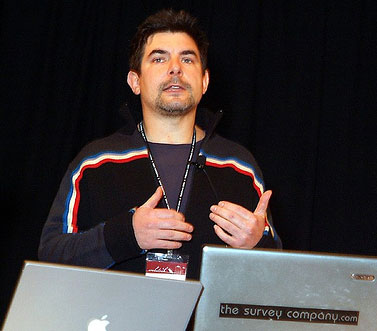 The 8x5 sessions
A chance for eight Webstockers to speak for five minutes each on an aspect of web usability/accessibility/whatever that interests them. Great stuff! Immaculately time-keepered and a great range of thoughts and ideas.
Everything from using Flash prototyping for wireframes (hi to my colleague Philip from Shift!) through an overview of Ruby on Rails and a look at what accessibility really means from a range of users' perspectives - and much more besides. Concluded by an inspiring rendition of The Web Times They Are A-Changin' by "Bob", ably accompanied by Zef using large-pieces-of-paper-with-the-words-on. Sure you can nick my idea, Zef - after all, I nicked it from Bob D in the first place... Rachel McAlpine - From plain language to F-language: we're ready for rules
Did you know when most people scan web pages they make a sort of "F" pattern with their eyes?
When we're looking through a web page to see if it contains the info we need, we don't "read" the whole thing from top to bottom, we "scan" it. Quick scan across the top from left to right and back again (taking in the logo, main nav and hopefully the page header). Then down the left-hand side (side nav, the first couple of words from sub-headers and paragraphs) and another horizontal scan further down the page (checking on a sub-header in full, or maybe a line or two of a paragraph which caught our eye). It takes just a few seconds, and if we don't find what we're looking for, we're gone.
Everyone it seems, writes for the web these days. "I say, have you see the report Jones has done. Let's stick it up on the website/company intranet". Writing for the web is a specialised skill, and one that doesn't necessarily translate well from print documents. Rachel talked about the need to start with plain language and then add the F-rules - where online content must be F-patterned (front-loaded and top-loaded), focused, functional, factual, fast, fresh, and frugal. Fabulous. Check out Rachel's website - Quality Web Content. Kelly Goto - About Interface: Designing for Lifestyle
Kelly discussed how interaction design is now not just about web. It's about all sorts of mobile devices and web apps and how we interact with them, in both our business and personal lives, and how the lines between the two are merging. She talked about how our approach must also shift into cycles of design and research centered around the way people actually live. Do you feel emotionally attached to this website/web app? Do you think it's useful? Does it meet your needs? Can you integrate it into your life? Ethographic-based research involving "deep hanging-out" helps companies to figure out how useful and viable their interface can be - both offline and online. Check out Kelly's blog on mobile usability and user experience. Steve Champeon - Simplicity, Web Standards, and Spam
Ah, Steve... I'm afraid I just got a bit lost during this presentation. Lots of technical and historical detail about web protocols and how this translates into the development of protocols for email. I think the uber-geeks liked it, though... The Trans-Tasman Tim-Tam, Chit-Chat Taste-off
Well of course New Zealand's own Chit-Chat beat the pants off the Aussies' Tim-Tam in the blindfolded taste-off. 'Nuff said. :)
More in Part Three...
Technorati tags: Webstock, New Zealand, accessibility, web conference, Doug Bowman, Joel Spolsky, Darren Fittler, Rachel McAlpine, Kelly Goto, Steve Champeon.
Saturday, June 24, 2006
Webstock 2006 - a review (Part Two)
Subscribe to:
Post Comments (Atom)


0 comments:
Post a Comment